

You may receive hundreds of visitors to your eCommerce website. However, if they are not purchasing things, your business will not profit.
Customers must visit product pages and add items to their online shopping carts. You can then walk them through the checkout process, asking them for payment and shipping information, as well as produce a sale as a result. The simplest method is to use Add to Cart Buttons.
In this article, I’ll show you the importance of Add to Cart Buttons and the top 10+ best practices for you to create the best Add to Cart Buttons that convert sales.
What are Add To Cart Buttons?
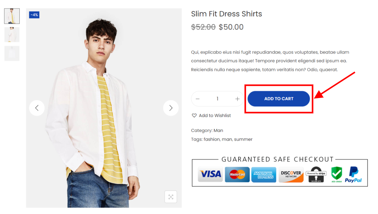
Add to Cart Buttons are rectangular, small, and clickable buttons that allow customers to add an item to their online shopping cart when they press them. They’re usually placed under the product’s name, product’s pricing, and product’s description on a single product page.
You can take a look at a typical example Add to Cart Button layout in the WooCommerce shop demo below:
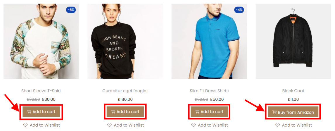
In some cases, the Add to Cart Buttons can also be placed on the shop or category pages, or in the related product section. So that, the customers can easily put the items they like into their shopping cart without taking a further step to the single product page. That can help you increase sales.
But these days, you need to be more inventive with the buttons you use to make them more attractive, which can encourage more customers to add products to their online carts.
How can the Add to Cart Buttons help with conversion?
Any internet business’s main goal is to convert site visitors into future clients.
A visitor’s desire to spend time on a website and perform the next required activity is driven by the user experience. A profitable Add to Cart button can just provide the extra impetus needed to send your visitors down the funnel.
Imagine that your customer has just had a look at those gorgeous Nike sneakers. They have the features, and pricing, and fit his feet perfectly. You’ve placed the magic item that reads “Add to Bag” precisely where it needs to be. Those stunning pairs of shoes will undoubtedly inspire the consumer to add them to their shopping cart. You have already won half the war!
Now that you have their attention, reward them with some sweet deals or a promo code, and presto, you’ve gained a new client.
In light of the foregoing, consider what would occur if the “Add to Cart” idea didn’t exist.
Let’s explore what happens if the product pages lack an Add to Cart Button!
- Your customers would frequently visit the products page and then leave to proceed to the payout page.
- Customers may become confused by the procedure and neglect to add anything crucial to their cart.
- Customers will find the process tedious and time-consuming.
- It will throw off the equilibrium of your online business with a higher bounce rate, and the user’s bad navigation will further harm it.
You now recognize the importance of the Add to Cart button in attracting clients. But it’s even more beneficial for your company. Let’s explore how the Add to Cart button might benefit your online business:
- By keeping an accurate record of every transaction that takes place on the platform, it supports the vendor and strengthens and improves the SEO of the website and search rankings.
- It gives the impression that the proprietor of the online store is a considerate and reliable online seller, which encourages them to take a more proactive approach to their business.
- This boosts average page views and dwells time while decreasing the bounce rate and the number of empty baskets on the online store.
- It improves the overall operation of the online store and enables the owner to create and manage a structured client portfolio.
- The alerts for consumers about discounts and special offers come in handy at the register, which helps to speed up checkout at your store.
- Easily connects third-party shopping solutions and aids in the clear presentation of prices, taxes, and additional fees.
The Add to Cart buttons ultimately increase sales, which is what every business wants to do.
How the Add To Cart Button can strengthen your branding?
The Add to Cart button may initially appear to be a small, unimportant component, yet it has the power to endear customers to your company. Your button’s shape, color, font, and text all have an impact on this relationship.
Additionally, the text on buttons is crucial. Compared to “Add to Cart,” “Add to Shopping Bag” sounds more like it belongs at upscale department stores. For long-established catalog companies that now accept internet orders, “Order Now” may be effective. The phrase “Add to Basket” is more commonly used in the UK.
Add to Cart Buttons: Top 10 Best Practices
Choose Rounded Corners
You might notice that the Add to Cart Buttons on the major three American online retailers, Amazon, Walmart, and Apple, all share rounded corners.
Consumers have been shown to be more drawn to user interface (UI) elements with rounded edges than those with sharp ones. Contour bias is a psychological theory that describes it. Even when they are digital, sharp items are avoided by our brains by default.
The Add to Cart Buttons on your product or service websites will feel a lot friendlier and upbeat if you choose to use rounded corners.
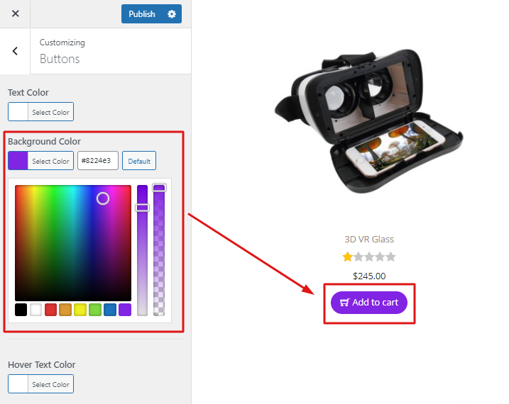
Pick the Add to Cart Button Color wisely
The color of your Add to Cart Button should match the colors of your brand in order to maintain consistency with the rest of your online store. But it’s crucial to pick a color (or perhaps even a gradient) that helps it stand out.
For instance, the website for REI has the Add to Cart Buttons that are dark green on a white backdrop. On its product pages, every other button and hyperlink has a much lighter hue as well. This produces the contrast required to focus customers’ attention on the button.
On the other hand, selecting a light gray button can make it disappear into a white background, which might reduce conversions.
Fortunately, you can easily customize the color of Add to Cart Buttons with some tweaks:
Make Your Button Pop by using style elements
After deciding on a color that completely contrasts with the background of your website, you can further customize your Add to Cart Button by adding extra eye-catching design elements. A thin border and a soft shadow, for instance, can help your button appear more three-dimensional.
In addition, you can include an arrow following the button wording. This tells customers that they will advance in the process and go one step closer to a solution after they click the button.
Consider the Button Hover Effect
Your call to action can get even more attention if the buttons you use are responsive, meaning they change color or move when you hover over them.
In addition to drawing greater attention to your button, these hover effects can let customers know that it is functional and will advance them to the next stage of the purchasing process if they click it.
For instance, when you hover over the Add to Cart Buttons at Target, a deeper shade of red appears. It’s a small improvement that gives their product list pages a more engaging, interactive feel and increases the clickability of their buttons.
On websites like CodePen, you can find a tonne of button hover effect examples together with CSS and HTML code to motivate your web team.
Making Add to Cart Button sticky
For people to shop on their mobile devices, brands aim to make the process as simple as possible. In addition to being time-consuming to navigate all the way back to the top of a page simply to add a product to the cart, browsing products on a small screen can be frustrating.
In that case, you should consider making the Add to Cart button sticky when visitors scroll up or down on your product page. For eCommerce businesses looking to increase mobile sales conversion, this interesting feature offers a straightforward option.
If you are running a WooCommerce online store, you can easily create sticky Add to Cart buttons by using Woostify theme.
Automate Button Changes for Out of Stock Items
The presence of an Add to Cart Button on a product listing indicates that the item is available for customers to purchase.
When customers have finished browsing your product images, reading the product description, and hitting the Add to Cart Button, your website informs them that the item is out of stock.
When a product isn’t in stock, think about automatically changing your button’s wording to “out of stock” and fading its color to improve the user experience on your online store.
Although this tweak won’t immediately affect your conversion rate, it will stop customers from having a bad experience while buying and deter them from coming back.
Reduce Clutter
The Add to Cart Button can stand out by being huge, but this will only be effective if there is sufficient white space around it.
A cluttered product or service website, such as one with an excessive amount of text or one that is disorganized, detracts attention from the button you eventually want customers to click.
Give your Add to Cart Button some breathing area and refrain from placing any page elements too close together. Your CTA will be more visible the less clutter you have.
Track the Conversion Rate
Making design adjustments alone is not enough to optimize your Add to Cart Buttons. It also demands you monitor the effectiveness of your buttons, so you can determine whether your improvements are really increasing sales or whether you still need to make some changes.
You may monitor button clicks and conversion rates on your website with the aid of programs like Google Analytics and some website builders, such as Squarespace. You may learn more about how your customers are reacting to changing colors, design components, effects, and other things by regularly monitoring this data, especially when you make changes to your Add to Cart Buttons.
Pro tip: Make tweaks gradually to allow you to test and distinguish between button elements that have positive effects from those that have negative ones.
Try Different Text for Your Add to Cart Button
For various businesses, several calls to action (CTAs) can be effective. Try experimenting with your button wording in addition to testing the conversion rates of different button styles.
For example, if you are running a dropshipping store, like on Amazon, the traditional “add to cart” CTA can not be as useful as “Buy from Amazon”. That would keep visitors shopping on your site and increase their purchase amount. Due to its ability to reduce the sense of commitment clients feel, this CTA can also be effective for high-ticket transactions.
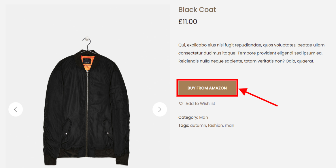
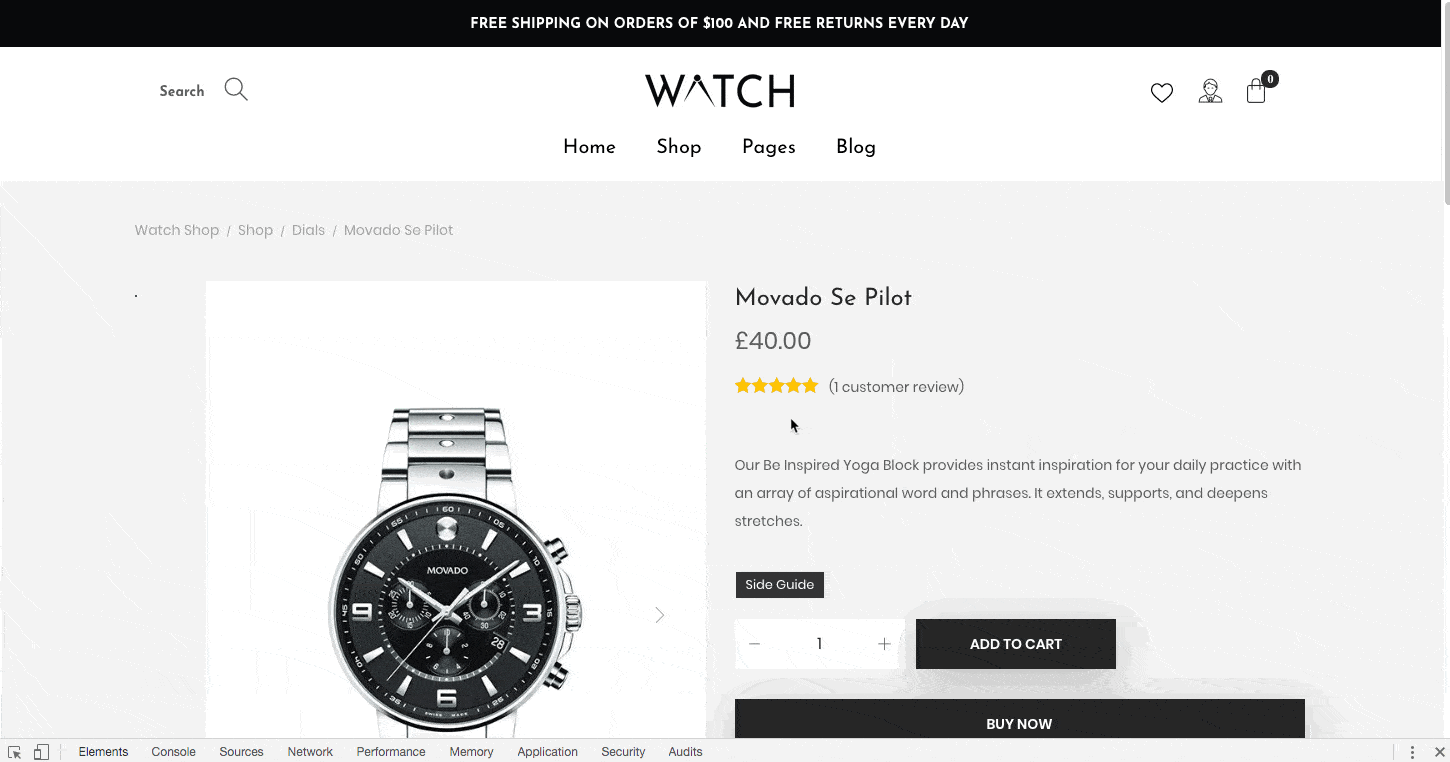
Not all eCommerce websites require an Add to Cart Button. Sometimes, a call to action like “Buy now” might increase the sense of urgency and result in a quicker closing if you anticipate customers to only buy one product or service from you or if your pricing is lower.
Regularly Test for Usability
Make sure to perform a comprehensive usability test on your Add to Cart Button whenever you make changes to it. Customers should find the checkout procedure simple and intuitive; therefore ask your end users how clear and effective the button’s function is.
Even if you don’t alter anything, check your Add to Cart Button for any issues. A client can be easily lost because of inadequate functioning.
Top 5+ Most Converting Add To Cart Buttons Design Inspirations
Are you prepared to glamorize the Add to Cart Button on your online store? Here are six excellent examples for you to get ideas from.
Warby Parker’s purchase buttons
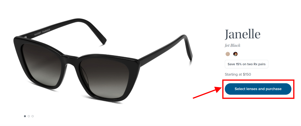
An add to cart button should not be boring. It’s there to draw attention to the page and make it plain and simple for a consumer to click the button and purchase the item they’re looking at.
However, this can be difficult for stores selling things with various possibilities.
Look at how Warby Parker does it. A pair of glasses can have hundreds of different configurations, such as frame sizes, lens prescriptions, and add-ons such as blue light blockers. Clients may be confused as a result of this; however, they use an Add to Cart Button captioned “Select lenses and purchase” to help lead customers through the process of personalizing the product.
Birchbox’s Add to cart options
Do you run a store that sells things through subscription models? You can still adorn the add to cart button, as this Birchbox example shows.
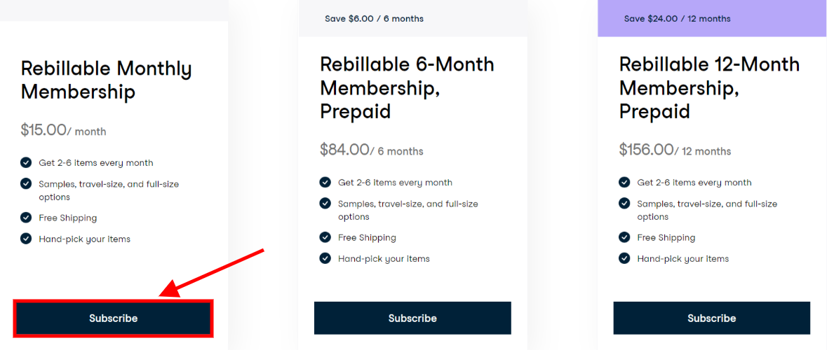
What’s intriguing about this example is the language utilized for the button. They’ve eliminated the boring and overdone “add to basket” language in favor of a “Subscrible” message.
Golde’s price in button
Many consumers add products to their shopping cart but do not complete the transaction because they find additional costs on the checkout page, such as delivery, shipping, or tax.
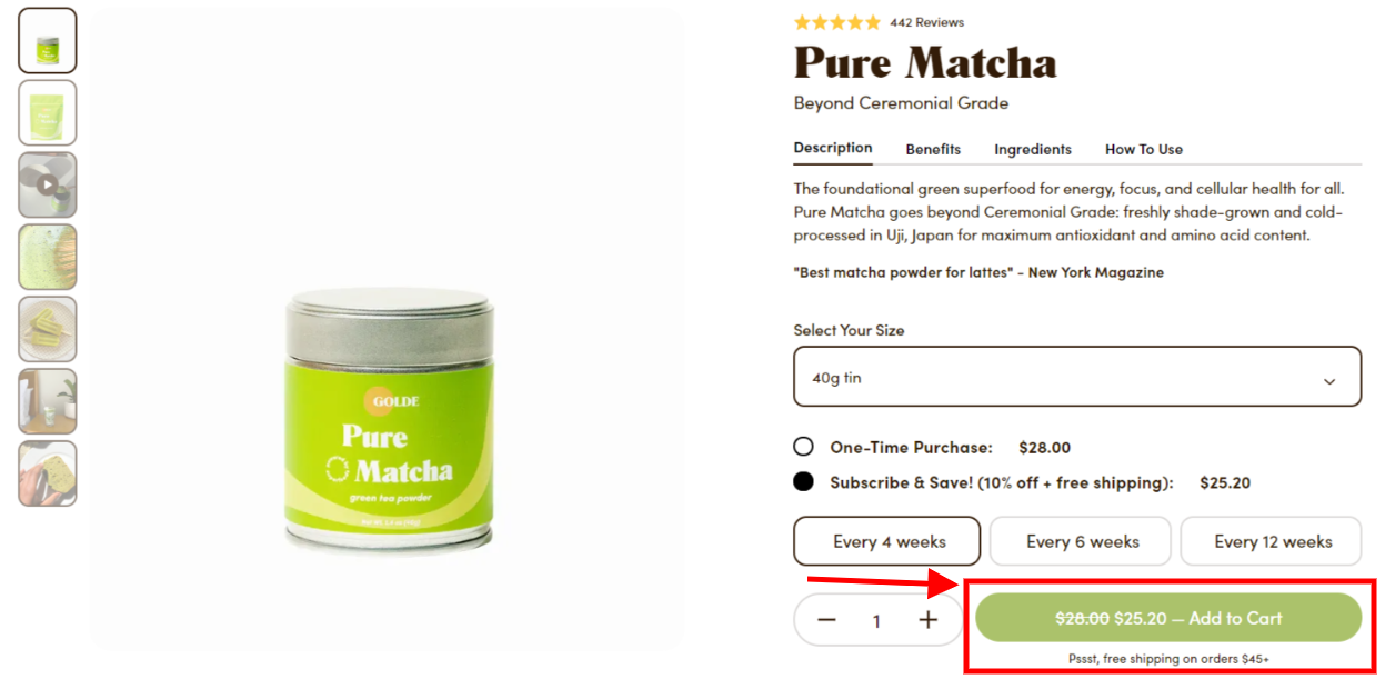
You can get around this by altering the content of your Add to Cart Button, as Golde did on their eCommerce site. They have the product’s price inside the button. When you get to the checkout page, you know precisely how much you’re going to pay. This might prevent up to half of their cart abandonment.
Etsy’s add to cart explanation
At first sight, this Etsy add to cart button example does not appear to be anything special. However, right beneath the button is a brief remark indicating how many individuals have the identical items in their online cart.
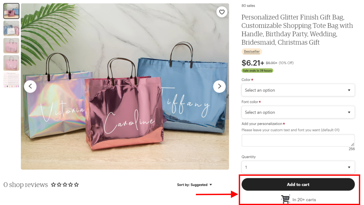
This generates a sense of urgency for the user to press the button. You want to add the item to your online shopping cart before it sells out.
It also aids in social proof. You’re demonstrating that other individuals are interested in the product and have even added it to their shopping cart. If other people are planning to buy something, it can persuade prospective customers to do the same.
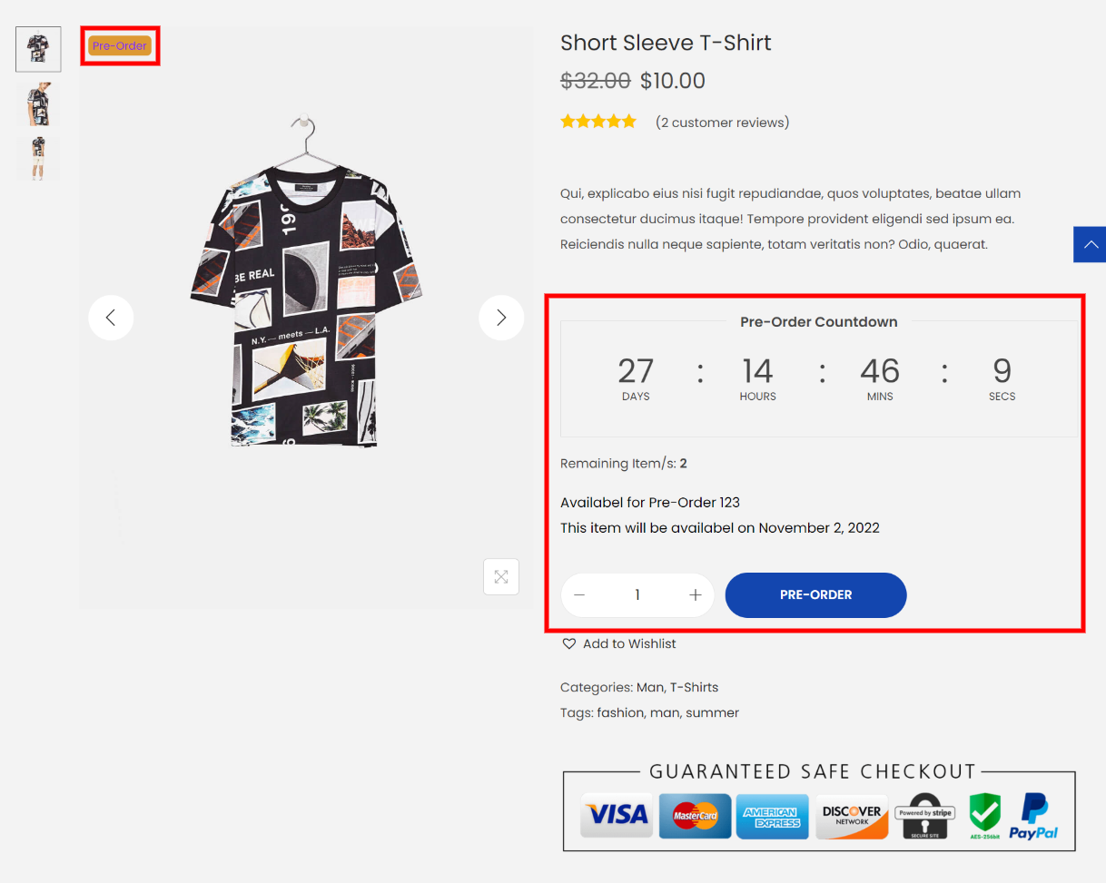
Ratio Coffee’s pre-order cart button
The Add to Cart Button is still useful even if your online business doesn’t currently have a particular item in stock.
Actually, all you need to do is modify the button’s text to “pre-order” as the way Ratio does in the example below. This still enables the customer to shop for the item, add it to their basket, and complete the checkout process. The item will simply be dispatched when it is back in stock.
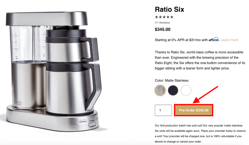
With Woostify theme, you can easily set up Pre-order for specific products with some clicks.
Bottom line,
Well! This article is for you if you want to decrease cart abandonment and boost sales! Your Add to Cart button is a crucial design component that must encourage action.
Despite their diminutive size, Add to Cart buttons are a must-have for every online retailer. These tiny, rectangular, occasionally-colored clickable serve as extensions of your branding and link products to shopping carts. It’s crucial to give careful consideration to choosing and setting up suitable Add to Cart Buttons designs for your eCommerce site.